
Mixture of Kernels#
It can be useful to model a dataset using a mixture of GPs. For example, the data might have both systematic effects and a physical signal that can be modeled using a GP. I know of a few examples where this method has been used in the context of time series analysis for the discovery of transiting exoplanets (for example, Aigrain et al. 2016 and Luger et al. 2016), but I’m sure that these aren’t the earliest references. The idea is pretty simple: if your model is a mixture of two GPs (with covariance matrices \(K_1\) and \(K_2\) respectively), this is equivalent to a single GP where the kernel is the sum of two kernels, one for each component (\(K = K_1 + K_2\)). In this case, the equation for the predictive mean conditioned on a dataset \(\boldsymbol{y}\) is
where \(N\) is the (possibly diagonal) matrix describing the measurement uncertainties. It turns out that the equation for computing the predictive mean for component 1 is simply
and the equivalent expression can be written for component 2.
This can be implemented in tinygp using the new kernel keyword argument in the predict method.
To demonstrate this, let’s start by generating a synthetic dataset.
Component 1 is a systematic signal that depends on two input parameters (\(t\) and \(\theta\) following Aigrain) and component 2 is a quasiperiodic oscillation that is the target of our analysis.
import jax
import jax.numpy as jnp
import matplotlib.pyplot as plt
import numpy as np

from tinygp import GaussianProcess, kernels, transforms

jax.config.update("jax_enable_x64", True)

random = np.random.default_rng(123)
N = 256
t = np.sort(random.uniform(0, 10, N))
theta = random.uniform(-np.pi, np.pi, N)
X = np.vstack((t, theta)).T


def build_gp(params):
    kernel1 = jnp.exp(params["log_amp1"]) * transforms.Linear(
        jnp.exp(params["log_scale1"]), kernels.Matern32()
    )
    kernel2 = jnp.exp(params["log_amp2"]) * transforms.Subspace(
        0,
        kernels.ExpSquared(jnp.exp(params["log_scale2"]))
        * kernels.ExpSineSquared(
            scale=jnp.exp(params["log_period"]),
            gamma=jnp.exp(params["log_gamma"]),
        ),
    )
    kernel = kernel1 + kernel2
    return GaussianProcess(kernel, X, diag=jnp.exp(params["log_diag"]))


true_params = {
    "log_amp1": np.log(2.0),
    "log_scale1": np.log([2.0, 0.8]),
    "log_amp2": np.log(2.0),
    "log_scale2": np.log(3.5),
    "log_period": np.log(2.0),
    "log_gamma": np.log(10.0),
    "log_diag": np.log(0.5),
}
gp = build_gp(true_params)
y = gp.sample(jax.random.PRNGKey(5678))

plt.plot(t, y, ".k")
plt.ylim(-6.5, 6.5)
plt.xlim(0, 10)
plt.xlabel("t")
plt.ylabel("y");
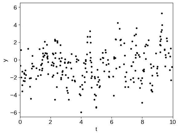
The physical (oscillatory) component is not obvious in this dataset because it is swamped by the systematics. Now, we’ll find the maximum likelihood hyperparameters by numerically minimizing the negative log-likelihood function.
import jaxopt


@jax.jit
def loss(params):
    return -build_gp(params).log_probability(y)


solver = jaxopt.ScipyMinimize(fun=loss)
soln = solver.run(true_params)
print("Maximum likelihood parameters:")
print(soln.params)
Maximum likelihood parameters:
{'log_amp1': Array(0.40650728, dtype=float64), 'log_amp2': Array(0.88691931, dtype=float64), 'log_diag': Array(-0.59618534, dtype=float64), 'log_gamma': Array(2.65016151, dtype=float64), 'log_period': Array(0.68890157, dtype=float64), 'log_scale1': Array([0.14407791, 0.20864149], dtype=float64), 'log_scale2': Array(1.04873101, dtype=float64)}
Now let’s use the trick from above to compute the prediction of component 1 and remove it to see the periodic signal.
# Compute the predictive means - note the "kernel" argument
gp = build_gp(soln.params)
mu1 = gp.condition(y, kernel=gp.kernel.kernel1).gp.loc
mu2 = gp.condition(y, kernel=gp.kernel.kernel2).gp.loc

plt.plot(t, y, ".k", mec="none", alpha=0.3)
plt.plot(t, y - mu1, ".k")
plt.plot(t, mu2)

plt.ylim(-6.5, 6.5)
plt.xlim(0, 10)
plt.xlabel("t")
plt.ylabel("y");
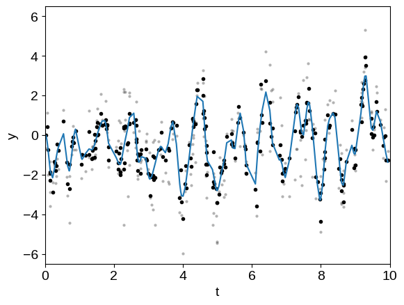
In this plot, the original dataset is plotted in light gray points and the “de-trended” data with component 1 removed is plotted as black points. The prediction of the GP model for component 2 is shown as a blue line.