
Multivariate Data#
Warning
If you previously used george, the way tinygp handles multivariate inputs is subtly different.
For kernels that depend on the squared distance between points (e.g. tinygp.kernels.ExpSquared), the behavior is the same, but for kernels that depend on the absolute distance (e.g. tinygp.kernels.Matern32), the argument to the kernel is computed as:
r = jnp.sum(jnp.abs((x1 - x2) / scale)))
instead of
r = jnp.sqrt(jnp.sum(jnp.square((x1 - x2) / scale))))
as it was when using george.
This is indicated in the kernels package section of the API docs, where the argument of each kernel is defined.
It is possible to change this behavior by specifying your preferred tinygp.kernels.stationary.Distance metric using the distance argument to any tinygp.kernels.Stationary kernel.
Also, tinygp does not require that you specify dimension of the kernel using an ndim parameter when instantiating the kernel.
The parameters of the kernel must, however, be broadcastable to the dimension of your inputs.
In this tutorial we will discuss how to handle multi-dimensional input data using tinygp.
All of the built-in kernels, support vector inputs out of the box, and this tutorial goes through some possible modeling choices in this context.
tinygp also supports structured pytree inputs when you use custom kernels as discussed in Derivative Observations & Pytree Data, or more complex transformations as discussed in Kernel Transforms.
In the case of vector inputs, most kernels have a “scale” parameter that scales the input coordinates before evaluating the kernel. This parameter can have any shape that is broadcastable to your input dimension. For example, the following shows a few different equivalent formulations of the same kernel:
import jax
import jax.numpy as jnp
import numpy as np

from tinygp import kernels

jax.config.update("jax_enable_x64", True)


ndim = 3
X = np.random.default_rng(1).normal(size=(10, ndim))

# This kernel is equivalent...
scale = 1.5
kernel1 = kernels.Matern32(scale)

# ... to manually scaling the input coordinates
kernel0 = kernels.Matern32()
np.testing.assert_allclose(kernel0(X / scale, X / scale), kernel1(X, X))
As discussed below, you can construct more sophisticated scalings, including covariances, by introducing multivariate transforms.
As discussed in Kernel Transforms, these transforms work by passing the input variables through some function before evaluating the kernel model on the transformed variables.
The transforms provided by tinygp—including tinygp.transforms.Cholesky, tinygp.transforms.Linear, and tinygp.transforms.Subspace—are all designed to operate on vector inputs and offer linear transformations of the inputs.
You can use custom transforms to build even more expressive models (see Kernel Transforms).
In this tutorial, we will use the tinygp.transforms.Cholesky transform to learn covariances between input dimensions, while the tinygp.transforms.Subspace transform could be used to restrict a kernel model to be applied to a subset of the input dimensions.
Simulated data#
To demonstrate how to use tinygp to model multivariate data, let’s start by simulating a dataset with 2-dimensional inputs and non-uniform sampling.
import matplotlib.pyplot as plt
import numpy as np

random = np.random.default_rng(48392)
X = random.uniform(-5, 5, (100, 2))
yerr = 0.1
y = np.sin(X[:, 0]) * np.cos(X[:, 1] + X[:, 0]) + yerr * random.normal(size=len(X))

# For plotting predictions on a grid
x_grid, y_grid = np.linspace(-5, 5, 100), np.linspace(-5, 5, 50)
x_, y_ = np.meshgrid(x_grid, y_grid)
y_true = np.sin(x_) * np.cos(x_ + y_)
X_pred = np.vstack((x_.flatten(), y_.flatten())).T

# For plotting covariance ellipses
theta = np.linspace(0, 2 * np.pi, 500)[None, :]
ellipse = 0.5 * np.concatenate((np.cos(theta), np.sin(theta)), axis=0)

plt.figure(figsize=(6, 6))
plt.pcolor(x_grid, y_grid, y_true, vmin=y_true.min(), vmax=y_true.max())
plt.scatter(X[:, 0], X[:, 1], c=y, ec="black", vmin=y_true.min(), vmax=y_true.max())
plt.xlabel("x")
plt.ylabel("y")
_ = plt.title("data")
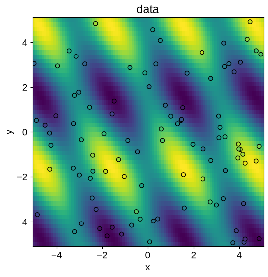
In this figure, the value of the noise-free underlying model is plotted as an image, and the data points are over-plotted on the same color scale.
A model with anisotropic scales#
Now, let’s fit this simulated dataset using a simple multivariate kernel that has a parameter describing the length scale in each dimension independently.
import jaxopt

from tinygp import GaussianProcess, kernels, transforms


def train_gp(nparams, build_gp_func):
    @jax.jit
    def loss(params):
        return -build_gp_func(params).log_probability(y)

    params = {
        "log_amp": np.float64(0.0),
        "log_scale": np.zeros(nparams),
    }
    solver = jaxopt.ScipyMinimize(fun=loss)
    soln = solver.run(params)
    return build_gp_func(soln.params)


def build_gp_uncorr(params):
    kernel = jnp.exp(params["log_amp"]) * transforms.Linear(
        jnp.exp(-params["log_scale"]), kernels.ExpSquared()
    )
    return GaussianProcess(kernel, X, diag=yerr**2)


uncorr_gp = train_gp(2, build_gp_uncorr)
Based on this fit, we can plot the model predictions and compare to the ground truth:
y_pred = uncorr_gp.condition(y, X_pred).gp.loc.reshape(y_true.shape)
xy = ellipse / uncorr_gp.kernel.kernel2.scale[:, None]

fig, axes = plt.subplots(1, 2, figsize=(12, 6), sharex=True, sharey=True)
axes[0].plot(xy[0], xy[1], "--k", lw=0.5)
axes[0].pcolor(x_, y_, y_pred, vmin=y_true.min(), vmax=y_true.max())
axes[0].scatter(X[:, 0], X[:, 1], c=y, ec="black", vmin=y_true.min(), vmax=y_true.max())
axes[1].pcolor(x_, y_, y_pred - y_true, vmin=y_true.min(), vmax=y_true.max())
axes[0].set_xlabel("x")
axes[0].set_ylabel("y")
axes[0].set_title("uncorrelated kernel")
axes[1].set_xlabel("x")
_ = axes[1].set_title("residuals")
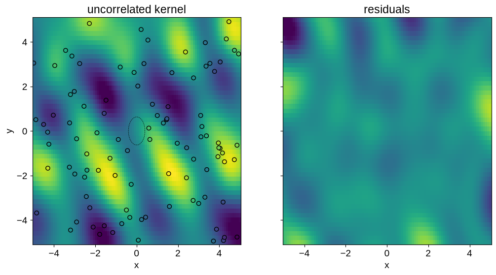
In the left-hand panel shows the model prediction on the same scale as the ground truth plot above. The dotted ellipse in the middle of this panel shows the maximum likelihood scale in the input space. This is axis aligned since our model only includes per-dimension length scales, with no prior covariance. The right-hand panel shows the difference between the model prediction and the truth, again on the same scale.
A model with correlated inputs#
The model in the previous section didn’t do a terrible job, but it seems likely that we could make better predictions by taking into account the covariances between inputs.
To do this with tinygp, we can use one a kernel transform, in this case the tinygp.transforms.Cholesky transform.
The Cholesky transform works by transforming the input coordinates \(x\) to
where \(L\) is a lower triangular matrix.
A good parameterization for \(L\) is to fit for its ndim diagonal elements with a constraint that they remain positive, and its (ndim-1) * ndim off diagonal elements, which need not be positive.
The Cholesky transform includes a tinygp.transforms.Cholesky.from_parameters() constructor (which we use here) to help when using this parameterization.
Using this parameterization, we can fit this model and plot the results as above:
def build_gp_corr(params):
    kernel = jnp.exp(params["log_amp"]) * transforms.Cholesky.from_parameters(
        jnp.exp(params["log_scale"][:2]),
        params["log_scale"][2:],
        kernels.ExpSquared(),
    )
    return GaussianProcess(kernel, X, diag=yerr**2)


corr_gp = train_gp(3, build_gp_corr)

y_pred = corr_gp.condition(y, X_pred).gp.loc.reshape(y_true.shape)
xy = corr_gp.kernel.kernel2.factor @ ellipse

fig, axes = plt.subplots(1, 2, figsize=(12, 6), sharex=True, sharey=True)
axes[0].plot(xy[0], xy[1], "--k", lw=0.5)
axes[0].pcolor(x_, y_, y_pred, vmin=y_true.min(), vmax=y_true.max())
axes[0].scatter(X[:, 0], X[:, 1], c=y, ec="black", vmin=y_true.min(), vmax=y_true.max())
axes[1].pcolor(x_, y_, y_pred - y_true, vmin=y_true.min(), vmax=y_true.max())
axes[0].set_xlabel("x")
axes[0].set_ylabel("y")
axes[0].set_title("correlated kernel")
axes[1].set_xlabel("x")
_ = axes[1].set_title("residuals")
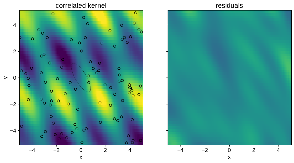
In this case, the input correlations are aligned with the shape of the true function, and our predictions have significantly smaller error, especially near the edges of the domain.